Posters are highly visual, deliver a concise message, and are easily read from a distance. Your choice of layout will depend on the number of sections you have, the content you need to include, and your task description. You may be provided with a template.
The layout of your poster will determine your visual structure and how you present your information.
Ask yourself these questions:
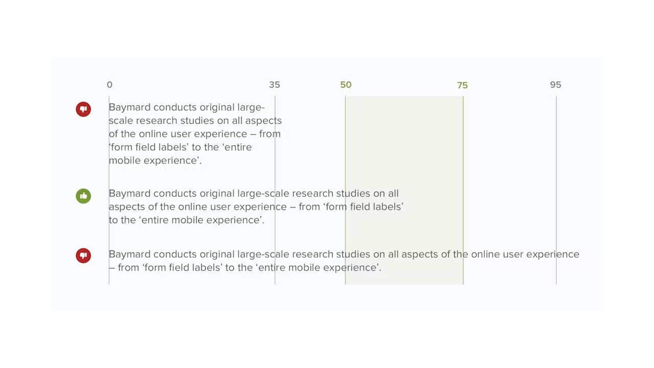
Figure 5: A visual showing different column widths for poster. Figure adapted from Scott, E. (2022, May 10). Readability: The optimal line length. Baymard Institute.
7. Alignment
Every section and panel should line up withing the overall structure of your layout.
Ensure constant spacing between each section and between each column.
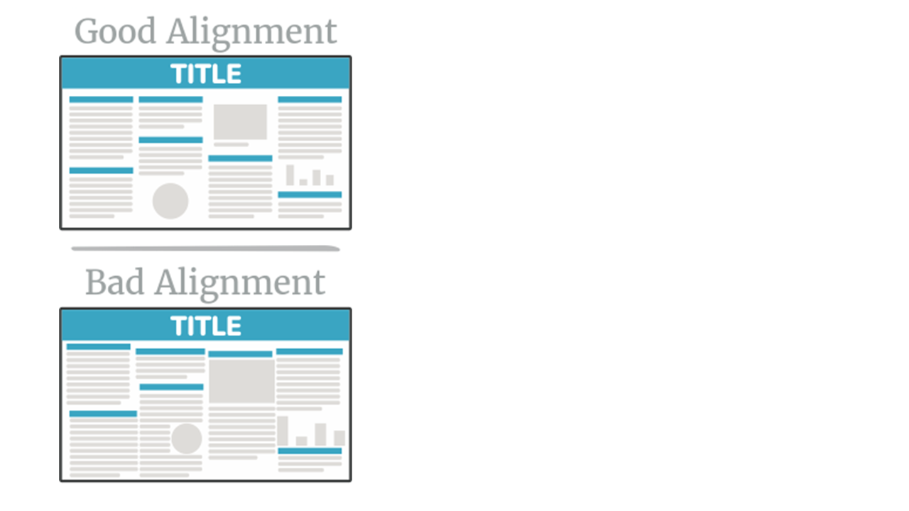
Figure 6: A visual showing section and column alignment for poster structure layout. Figure adapted from PosterNerd. (n.d.). Scientific poster design and layout: Fonts, colors, contrasts, screen vs. print.
8. Negative space
Negative space or white space is what is left empty without text, images or other elements.
Without sufficient white space, your poster will look cramped or busy.
The poster should be eye catching, readable, engaging, and easy to follow.
There are several elements you need to keep in mind:
Graphics:
Font type and size:
Colour:
Example:
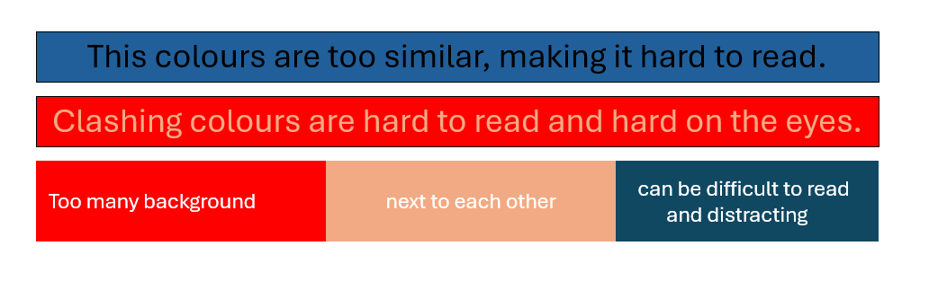
Figure 7: A visual depicting the use of colours in a poster. Figure adapted from My Assignment Services.