The task instructions and rubric are your guide for organising the content. Despite discipline specific elements, many posters include the following sections:
| Title | Capture what you are presenting and help viewers understand the topic quickly. Choose an engaging title to encourage your audience to take a closer look. Caution: If you report numerical findings in your title, keep in mind that your viewers may consider it as a “factoid”, so select it carefully. |
| Authors | Include who developed the poster, who was involved in the research project, and your contact information, for example, your email or social media handles, so the viewers can reach you. |
| Introduction (Background & gaps in the literature) | Outline the current literature, any gaps in the research literature and the problem you hoped to solve. |
| Research aim | What did your research set out to do? Include your research questions/hypotheses that you hoped to answer. |
| Designs and methods |
Your methodology, approach, materials. What did you do? |
| Results (Outcomes/ Key Findings) |
What are the outcomes produced by your research? |
| Discussion/Conclusions |
Your interpretation of the results. |
Tips:
For science disciplines, posters often adapt the IMRAD structure (Introduction, Methods, Results And Discussion). Although not included in the name, these posters also feature a Conclusion. Find out more about the IMRAD scientific report writing here.
There are several questions to ask when displaying data:
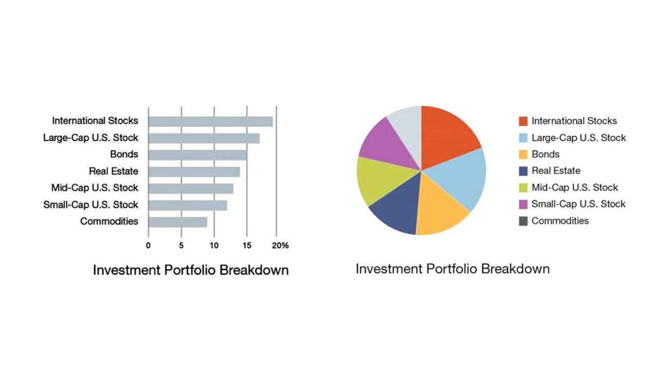
Figure 1. A graphic shows the differences between a bar chart and a pie chart. Figure adapted from Duarte, N. (2014, April 16). The quick and dirty on data visualization. Harvard Business Review.
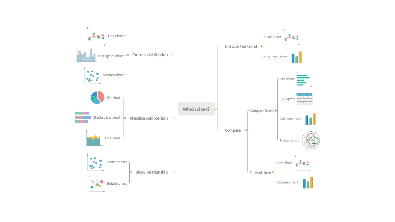
Figure 2: A visual showing different types of charts that demonstrate the relationships in your data. Figure adapted from A Well Defined & Well Designed Dashboard Guide.
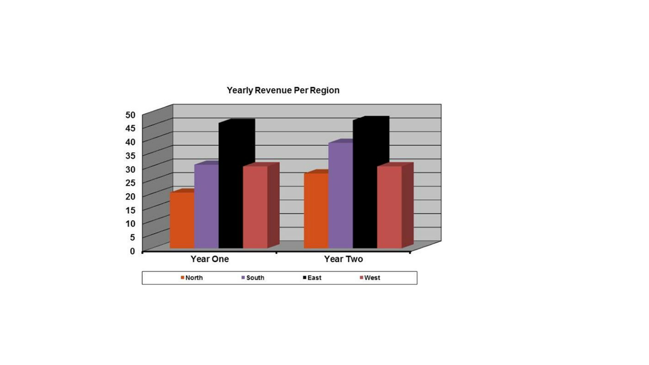
Figure 3: A visual displaying a side by side bar chart, presenting yearly revenue per region. Figure adapted from Duarte, N. (2014, April 16). The quick and dirty on data visualization. Harvard Business Review.
Looking for help to select the right data visualisation for your poster? Check out the additional resources section:
When describing patterns or numeric contrasts, regardless of the level of statistical complexity of the analysis, it is important to explain the direction and magnitude of the association, concepts under study and units of measurements rather than reporting coefficients (Miller, 2013).
Example:
| Text quality | Example text | Comments |
| Poor | “Number of enrolled children in the family is correlated with disenrollment.” | Neither the direction nor the size of the association is apparent. |
| Poor | “The log-hazard of disenrollment for one-child families was 0.316.” | Most readers find it easier to assess the size and direction from hazards ratios (a form of relative risk) instead of log-hazards (log-relative risks). |
| Better |
“Families with only one child enrolled in the program were about 1.4 times as likely as larger families to disenroll.” | This version explains the association between number of children and disenrollment without requiring viewers to calculate the log-hazard themselves to assess the size and direction of the association. It also explicitly identifies the group against which one-child families are compared in the model. |
Example:
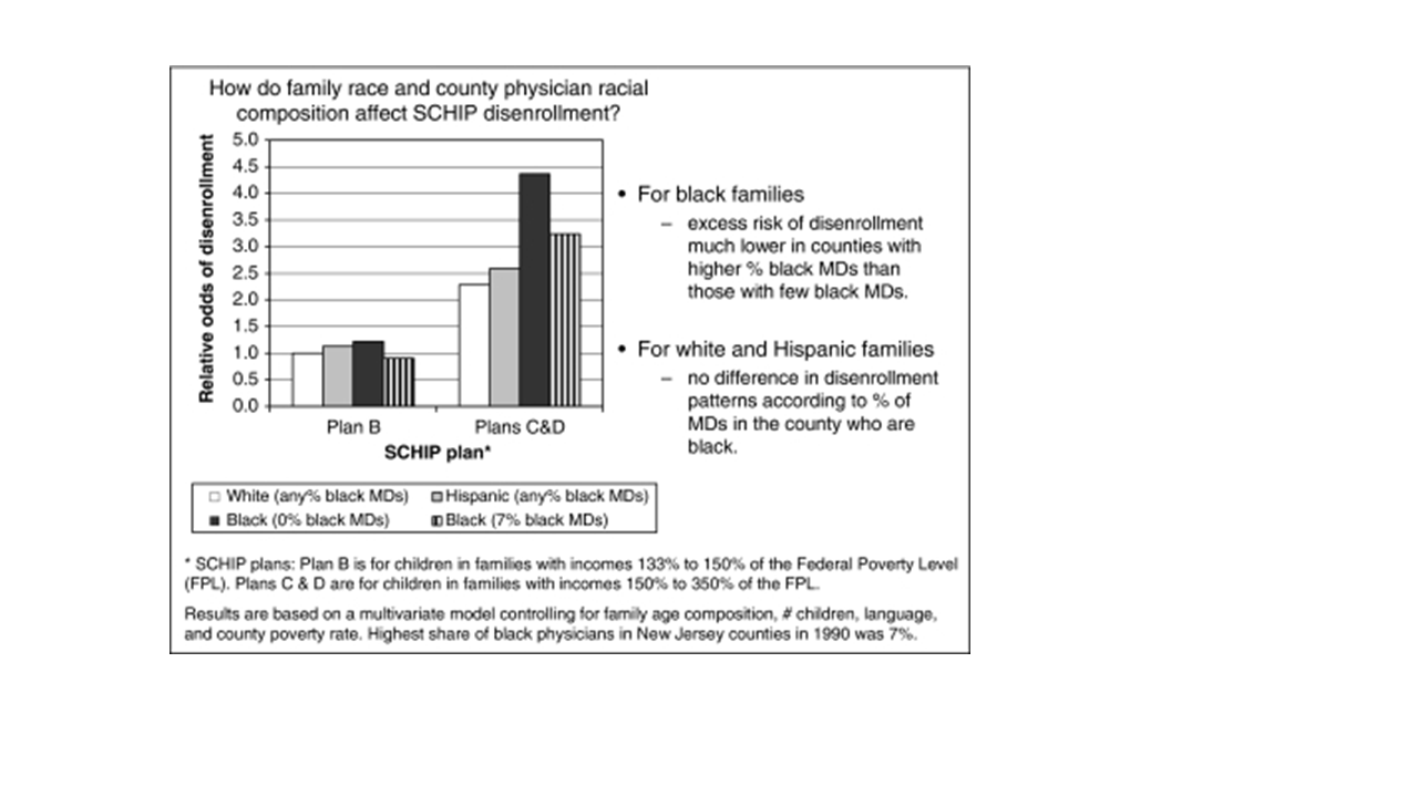
Figure 4: A visual showing side by side bar chat, depicting odd ratios of disenrolment from NJ KidCare by race of family and percentage of physicians. Figure adapted from Phillips, J. A., Miller, J. E., Cantor, J. C., & Gaboda, D. (2004). Context or Composition: What Explains Variation in SCHIP Disenrollment? Health Services Research, 39(4p1), 865–886. https://doi.org/10.1111/j.1475-6773.2004.00262.x
Looking for help to select the right data visualisation for your poster? Check out these resources: